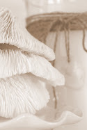
I've been creating a 'Mantel of the Month' on my website for about five years now. This monthly feature encourages me to change my mantel out every month that's for sure... (whether I'm ready or not)! This morning, this new month, I was really ready. You see, I've been painting the living and dining rooms at the cottage 'Simply White' (more on that coming soon) and I'm finally at the decorating stage! So, I have a question for you all....a survey if you please...
Do you like Mantel #1. Pure & Simple or Mantel #2 with a Little More Fluff?
I'd love to hear your thoughts...
To see more mantels and the decor changes over the years check out Mantels and scroll down to the archives.


.jpg)


13 comments:
I always look forward to seeing the new mantle photos, they are very creative! The both mantles are lovely, but the first one is more soothing to me for some reason. I guess I just prefer the all white & cream combo.
Hi Roberta,
Sorry to hear about the shop. I recieve Mantle of the month emails and I love them. My family had a clothing store for over 80 yrs. When the mall came in...need I say more? The ecomony is tough on brick and motar stores. My friend owned Primitive Dwelling out on Rt 6 and she is now down south. The mantles in your post are both great, but I am drawn to the first on.
Take care,
Donna
HI Roberta
I think both your mantels look wonderful. I probably prefer #2 as the dark accents give more definition to the whites, but really I love both. Have a great week.
Hello Roberta, they are both beautiful, but I tend to believe you can't have too much "fluff"... so I pick Mantel #2... I must check out your older post, I didn't know you did a mantel of the month... Hey, I also ordered the new Jeanne d' Arc Living magazine from your shop this morning... can't wait to receive it! Bisous... Julie Marie
Hi Roberta,
I love the white paint!! Beautiful!!
I think I prefer #2, simply because the dried flowers and candle holder give a bit of contrast. Don't I sound like I have a lot of expertise on the subject?
I must say, I gasped when I saw that you had a "mantel of the month". I have even suggested that someone (not me, I'm terribly unorganised)have a mantel party. You see, I need help. In a big way...my fireplace and mantel are HUGE and I just can't get it right. I never have. I need inspiration and ideas. I need Mary Carol Garrity...
So I am definitely going to check out your mantels. I'm so glad I stopped!!!! :-)
xoxo
Janie
Wow-5 years of changing the mantel every month. 60 mantels. Now that is inspired! You would be very sad if you could see mine right now. Most nights we clear it off to project films on the wall above the mantel, and I'm losing motivation to keep putting things back up. I like the 2nd mantel, not fluff but contrast.
Enjoying your music, looking at the mantles for a long time. They're both lovely, but the first picture is best for me... it feels lighter, yet somehow more grounded.
Nice.
~Julia
Hi there Roberta~~I love to see beauty in many different forms so both your mantels are enjoyable ~ my favorite is mantel #2. It moves my heart more. I have been checking on your website for a couple of months in the mantel archives ~ I must applaud you for all of your inventive ideas for so many different mantels--I can fret & fuss over my one and then it is so "right" that I rarely change it! I did notice in the mantel archives that you mentioned a couple of months ago that some readers had told you that you used way too many items--too crowded. I don't think so at all--I do know there is a point where it can reach too much--I do not think you ever overdid it even a year or two ago. I simply stare at those beautiful mantel images and soak them up!! They can be sort of addictive--I may have to check them out again sometime today or tonight. Thank you for such beauty...
Cynthia K.
Hi Roberta!
I LOVE ths soft romance of the first mantel. It just looks right to me.
Hugs,
Amy
Hey Girls, Reading your comments has sure been enlightening and encouraging. Thanks for telling me WHY also. I sure do appreciate it! It keeps me motivated ~ xo Roberta
So lovely! I think I like number 2 best, especially since the weather's getting colder.
I actually love both Roberta! Those chunky soaps are delicious! I think both work for different moods and textures...fabulous!
I'm not a "less is more" kind of gal so I like the second one best. The contrast really makes the display POP.
Post a Comment